Similar Reads: Best Computers For Graphics Design Android 10 brought a handful of updates and cool features, such as a system-wide Dark Mode, but very little in the way of any actual UI update. Google has stuck with the material design because it works so well, so this guide will be applicable for previous Android versions as well (Oreo, Pie, etc). Knowing how to properly design UI elements for Material Design will help with a lot of things, from developing apps that perform well on Android devices, to getting your custom themes accepted in theme stores, such as Samsung Theme Store. You can also read these other topics on Appuals, which will give you a lot of extra information relevant to this topic:
How to Include a Dark Theme in your Android AppHow to Start Developing Android Apps in Visual Studio 2017How to Build a Custom ROM from Android Open Source Project | Pt. 2How to Manually Theme Android System UI (some of the steps may be outdated for Android 9 / Android 10, but the overall information is still very useful.)
An overview of Material Design
Material Design revolves around a few important things. Color palette, responsive grid layout, and knowing your way around the Android System UI, if you’re designing themes. For developing apps, you need to be aware of all of the above, plus things like Android runtime permissions and requests, if your app will access the user’s storage folders, camera, etc. This page on the official Android Developer goes much deeper into the privacy and permission changes that app developers should be aware of for Android 10. But for the most part, we’re going to focus on theming, not actual app development, for this article.
Color palette
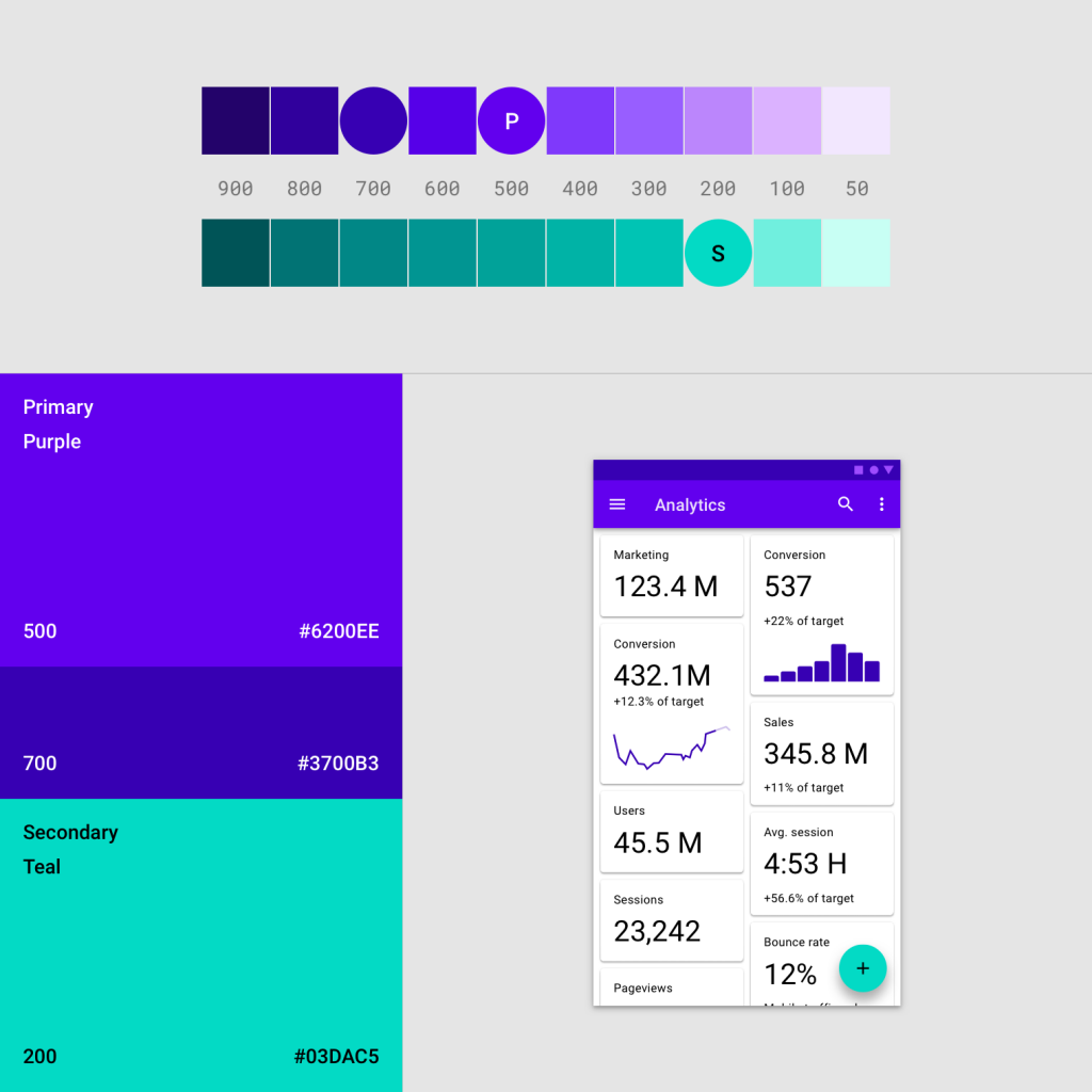
For Material Design color palette, Google prefers a “two color” system with variants:
So for example, like in this photo. Your primary color would be purple, with your secondary color as cyan. And then for other elements of your UI, you would use shade variants of purple and cyan, so everything blends together. This Material Design editor is a very useful tool that helps you put together color variations. You can also look for inspiration from professional UI/UX design agencies like Clay, or this list of the top-rated web design companies in 2019.
Responsive grid layout
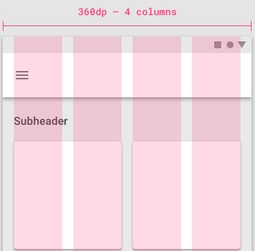
Understanding responsive grid layout means understanding how pixel density and automatic screen adaption works. For the most part, the average Android phone DPI is somewhere between 300 to 480 DPI. With that in mind, a 300 DPI screen will typically be able to display up to 4 columns:
Whereas a screen with 600 dpi will display up to 8 columns. Between each column are “gutters”, basically the areas that separate each column. So on a mobile with 360dp, each gutter would be around 16dp.
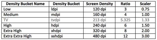
Understanding screen DPI
When designing UI, whether it’s system UI or your app’s UI, you need to take into account the different pixel densities of different phone sizes. Here is a chart of the most common screen resolutions and pixel densities:
So as a rule of thumb, when designing a “global” theme or app, and not focusing on creating themes for a single device, you should start at the lowest density. This is because if you start your design at 1x, you simply have to take measurements in pixels, and the values will remain the same across DPs. However, if you design for 3.5x, you need to divide all values by 3.5 for adapting to other densities, and then it just becomes a headache of calculating multiple DP values.
Additional tips for Android 10 UI/UX design
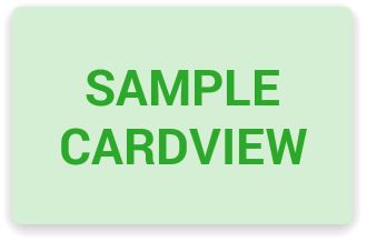
If you need a custom color for theme components such as radios, buttons, checkboxes, etc, you should not use drawables to show the various states (checked, clicked, etc). Because when you use drawables, you lose the native Material Design effects (like ripple) which Google extensively updated in Android 9 and Android 10. When working with Material Design, Google includes a lot of goodies that you can take advantage of, and they will flow more naturally with your UI/UX. So for example, here are a few keywords for theming components with built-in Material Design elements, and your app or UI/UX will still enjoy the native system behaviour and UI states. To show a simple shadow below components like in cardview mode, you just need to use the elevation property.
Merging tags and parent properties is extremely useful, to give you better control and manageable XML files. Animated layout changes can really improve your UX, and nearly all ViewGroup will respect this. So whenever there is a change in the view hierarchy, it will come with an animation. With a bit of know-how, you can also design custom transition effects.
YouTube Introduces Ambient Mode and Much More in its Latest Design ChangesFacebook Oculus Quest 2 VR Headset Latest Edition Leaks With 2K Per Eye Res. 6GB…Microsoft Accepts BSOD And Other Issues Caused By Latest Updates Which Arrived…Microsoft Windows 10 Update Delivery And Packaging Technique To Get Combined…